The business logo is perhaps one of the most essential tools within any company’s marketing arsenal. Here, we take a look at how the concept of the humble logo has developed over the centuries to become the staple of industry that it is today!
The logo – distilled
Ever wondered where it all began?
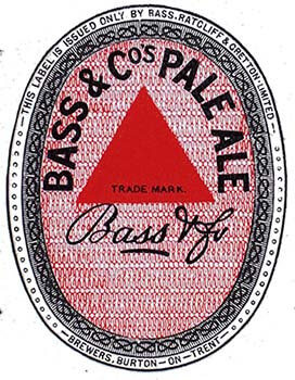
Well, it’s near-on impossible to tell exactly where the concept of the logo stemmed from. But we do know who holds the rights to the very first trademark in the UK. Right at the end of 1875, an employee from Bass, a brewery which at the time was exporting its pale ale around the world (and blazing a bold trail in terms of its approach towards what we would now describe as branding and marketing), queued up to speak to a representative at the British Patent Office. He returned to work on New Year’s Day with all of the paperwork confirming that he and his business were the proud owners of the British Empire’s first registered trademark, and effectively the UK’s first officially recognised logo: a red triangle framed by the words “Bass & Co’s Pale Ale”.
Whether this tale is accurate or not, businesses in the 19th century were starting to realise that the humble logo was a straightforward yet crucial means of conveying a brand and its values to customers. Despite its minimalism, it must convey everything that a company represents: it has to be relevant, memorable, simple, unique, versatile; all of this within the limitations of a graphic and a couple of words, letters, or sometimes even less.
When it comes to logo design, cutting corners has always been risky business
Getting the logo right is often more important for SMEs than multinational corporations. Massive businesses have the luxury of large-scale budgets to ensure that even the vaguest, most inappropriate logo can be thrown into the market and loved by force. By contrast, a smaller, lesser-known may have limited opportunities to make an impression – and a logo for an SME needs to shout louder to make up for the company’s limited resources.
This is why choosing cheap, cheerful or off-the-shelf designs comes with an awful lot of risk. Even if money is tight, this is a part of the brand identity process that needs to be handled by a design professional, because a step in the wrong direction could spell disaster for an evolving business.
For example, without expert advice, how would a finance company ever realise that research into customer psychology suggests that orange is a colour best avoided? Or that red is a poor choice for travel companies? Or even that choosing inappropriate colours can sometimes be a smart move because, with the right research, the dissonance can disrupt a marketplace and allow a brand to stand out amongst its competitors? Given that 90% of consumer judgement is based on colour, can a company afford to take risks with such a fundamental decision? SMEs can quickly regret cutting corners as the damage to trade and the cost of rebranding can be devastating. It goes without saying, then, that the first step to success for any enterprise is to get its logo design right.
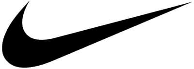
Looking to the logos of massive corporations for inspiration can be useful, but while many of the principles of logo design are universal, many are not. For example, the Nike swoosh might be a triumph of minimalist design (and it only cost only $35!), but SMEs do not have marketing budgets that run into hundreds of millions of dollars and the luxury of 50 years in which to carve a presence into mainstream culture.
In addition to this, many multinationals have designs that are of their time and only work today because they have achieved ‘classic’ status, and have the ability to conjure up an emotional connection to their history on demand. And just because a company is vast and successful doesn’t mean that their logo is good; there are plenty of disastrous choices made by executives who haven’t taken the right advice, and companies that have succeeded (or perhaps survived) in spite of some appalling design decisions.
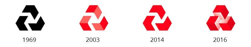
“Do the people on these boards have the experience or the discernment or the interest to make effective judgments?” – revered designer Michael Wolff, describing NatWest’s recent rebranding exercise.
Brands through the ages
While 1876 might mark the rise of the first officially recognised logos, there is some evidence to suggest that these kind of monikers were around thousands of years before they became a mainstream concept. From the Greeks marking their pottery, to Egyptians branding their animals with hieroglyphs, to coats of arms depicting the power and status of noble families (both real and fictional!), to religious symbolism – logos have always had a common purpose: to communicate an identity.

The Dharma wheel, a historic symbol of Buddhism, representing Gautama Buddha’s teaching of the path to Nirvana, and dating back to the the 4th Century BC.
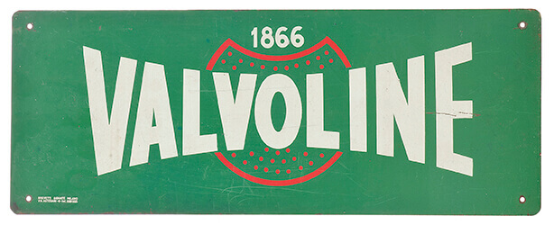
It was once simply a means of saying to illiterate customers “this is my trade”, but the logo has evolved. The printing press and the industrial revolution gave rise to an explosion of commercialism, and with it, advertising. Companies were founded – some like Bass with global reach – and competition ensued, as did the need to establish a stand-out brand. The 19th century saw dramatic developments in terms of brand identity, such as Valvoline creating one of the earliest examples of what we understand today to be a commercial logo.
The post-war capitalist boom and the digital era have contributed to a moment where branding has never been more important. Lives and lifestyles have become more complex, visual culture has become so dense, and imagery is stacked up so high and so intensely that it’s becoming more and more difficult to hone in on what’s important and filter out the rest of the commercial noise. Any great logo designer will need to have the ability to crystallise an idea into something simple, striking and effective if your company stands a chance of being heard amongst all of the competing voices.
Logos combine art with practicality and purpose
So clearly, then, logo design is a complicated business. But as well as needing to make a discernible emotional connection, a company logo needs to be functional. Whether it’s being ironed onto staff uniforms or plastered across the side of a building in neon paint, it needs to be adaptable enough to look appealing across a range of different media. The clarity and impact of a logo shouldn’t be compromised by its application, so versatility is key here.
A brilliant designer will come up with not just an individual design, but with a full package that contributes to a complete branding identity. A single, striking idea can be expanded to create variations, such as colour palettes that can be ascribed to specific marketing campaigns, or monograms that can be incorporated into other elements, such as a fleet of cars or a watermark.