Carry out a quick Google search, and you’ll find thousands of examples of poorly designed logos from the last hundred years or so. (Yep, that’s right – logos have been around in one form or another since before the turn of the 19th century! You can learn more about where logo design began here.)
And unfortunately, even the biggest, best and most cash-rich companies are still occasionally launching sub-standard logo concepts. Here, I’ve pulled together five of the most controversial logo designs from the last few months.
1. Australia’s trade logo
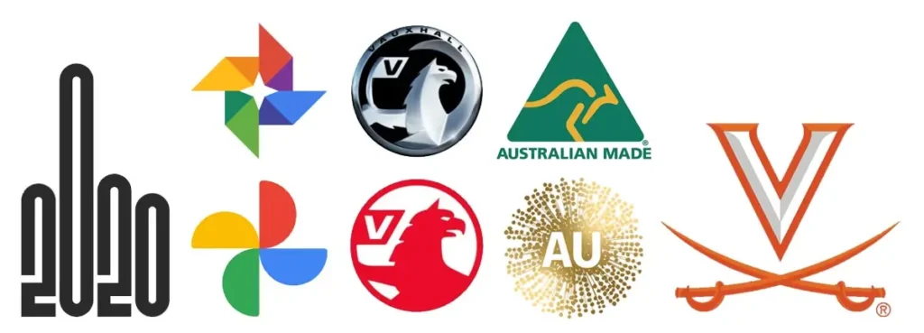
At the start of July, CNN Style put together this piece pointing out the fact that the latest Australian Made logo looks strikingly similar to the graphical interpretation of a certain virus that’s been dominating global headlines for the last few months.
The illustration – which was in fact supposed to resemble Australia’s national flower, the golden wattle – also looks starkly different to its predecessor, a green and gold kangaroo which is apparently still going to be in use elsewhere in Australia’s branding strategy.
Criticism has been harsh, with a certain Queensland MP implying on Twitter that school students could have come up with something better! What do you think?
2. Vauxhall’s new brand logo
For the first time in 12 years, British car giant Vauxhall has updated its brand image with a simpler, flatter version of its long-time metallic-style 3D emblem. It still features a griffin holding a ‘V’, but it’s a much more straightforward take on what used to be a sophisticatedly shaded badge.
This shouldn’t come as a surprise, really, as 2020 has brought with it a definite trend for minimalistic design – but, as Creative Bloq explains, this particular revamp seems to have lost some of its pizzazz in the revision process. Whatever your opinion might be of Vauxhall’s new logo, it will certainly be easier to reproduce across digital assets and printed materials, which perhaps justifies the manufacturer’s change of direction.
3. The Typeo echoes the current public mood
2020 has been a tough year for most of us – and it looks like artist The Typeo decided to reflect national feeling in its latest design, which looks suspiciously like a rather acrimonious hand gesture. Judge for yourself!
4. Google Photos’ flattened and simplified logo
Google sometimes refreshes its app logos, and a few weeks ago it applied some timely design treatment to its Photos moniker. According to a statement straight from the search giant (mentioned in this article) the pinwheel arrangement, which now lacks its signature gradients, is supposed to be a nod to beachside nostalgia.
Not everyone is a fan of its decidedly dumbed-down look, though, with some Twitter users labelling the new Google Photos logo as too simple, and others saying that they, quite frankly, ‘hate it’. Is this a case of fixing what ain’t broke?
5. University of Virginia’s design mishap
Earlier in the year, the Athletics department of this prestigious college unveiled a new logo to a mixed reception, largely because many people noticed subtle yet important links to slavery symbolism in the new concept. By June, the institution had eliminated the serpentine curves on the handles of the sabres within the design and inserted straight-line handles instead.
This is certainly a lessen to designers in checking the implications and connotations of their design elements before taking the idea to pitch stage!
Want to make sure your new logo doesn’t go down like a tonne of bricks with your target audience?
I’ve got decades of experience in creating unique logo designs for companies that want to explore a stronger brand identity. Whether you need me to rework something that’s been part of your brand for years, or you’re happy for me to start with a blank canvas, I guarantee I’ll develop something you and your team can be proud of. I can also help you navigate the legal side of logo design so you’ll never have to worry about trademarking issues later on.
