Turn these changes to your advantage
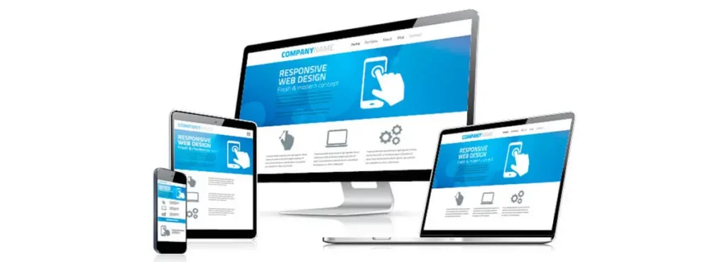
Website owners are rightly concerned about mobile-friendly requirements, but with careful design, you can make your page stand out for tablet and mobile users.
Google’s latest mobile-friendly requirements mean that website owners have been under a lot of pressure to convert their site to something that can be viewed on mobile devices. One of the side-effects of this change is that traditional ways to spice up a website, by using images and flash player videos or decorative fonts, are now going to have to be discarded in favour of restrained decoration that allows mobile users to find what they want easily.
If you have been attempting to upgrade your website in order to comply with Google’s new requirements, then you may have been left with a site which has no real style, and is instead just a blank wall of content with a few buttons at the side. Your website doesn’t have to be like that, and you can improve your website design and add style back into your pages by following this guide.
Make sure that your website is uncluttered
Without much decoration, website owners may be tempted to crowd in information and pictures of products without any idea of the end result. Sometimes, poorly designed web pages will deter visitors from returning, and so it is important to have a clean and tidy website.
If you are concerned about the amount of information on each page, then you should try concealed information, known as ‘Ghost buttons’, that will only show off details of a page when the viewer hovers over it. They are one of the most stylish ways of ensuring that your website has a clean and organised design, while still including all of the information that you require, and could be one of the website trends for 2015.
These buttons can also have links installed in them, so that hovering over them will provide a button taking the viewer to another page.
Improving your website’s mobile appeal
Most traditionally-built websites, and certainly those more than a year old, will need to be updated in order to comply with the new trends for mobiles.
The first step in updating the website will be to incorporate a CMS system which is designed to help you edit and monitor your pages more effectively. It is currently advisable to remove software from mobile websites that is not suitable for mobiles, such as Flash and video players that the mobile cannot use.
Avoiding pop-ups and ensuring that your pages allow CSS and JavaScript will help your website to look more attractive and also load faster on mobile phones. Applying a mobile template to your website can also help you to design and structure your web pages to ensure that mobile users are able to view your site easily.
You should also look at the text and images that you use, paying particular attention to the size of letters and pictures. Most websites will be able to size your content to fit the mobile screen, but this can leave them unable to read your site due to small letter size, or having to zoom or scroll in order to see the whole of one picture. Websites that have correctly-sized content are more likely to be able to attract visitors.
Although building a new mobile-friendly website may sound like a daunting task, skilled web developers are able to incorporate design aesthetics with the new demands set by mobile technology and Google’s search quality guidelines. Your website can look fantastic and perform well on mobile.