You might have noticed Design FX Studio is looking a little different these days…
It’s been years in the making, but after a lengthy design process, I’m pleased to launch my new-look website!
Why did I decide to redesign my site?
When it comes to design, I like to practice what I preach. I always advise my clients to refresh their branding and their website every few years to keep their company image current, so I felt it was about time I did the same myself!
I knew I needed to create something that not only looks as good as my competitors’ efforts, but that is easy to navigate and – dare I say it – fun to interact with. I wanted to create an aesthetic that was more in line with what users expect to see these days, too.
What’s new?
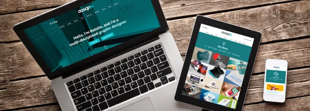
The new Design FX Studio website is, quite literally, bigger and better than any of its previous incarnations. I decided to re-build the site in WordPress because the CMS allows me complete control over everything, from the size of the font to the posts I include in my blog.
The platform makes better use of more contemporary web design trends, such as parallax banner images, to ensure a cleaner, fresher feel across the board. The calls to actions are clearer, the colour palette is more striking, and – crucially – the template looks just as fantastic on mobile devices as it does on desktop screens. For me, it was hugely important to invest in a responsive design; as this recent blog post explains, mobile usage is set to rise even further in the next few years, so I need to ensure my content is easily accessible to everybody, regardless of the technology they’re using to reach me.
My Portfolio has perhaps had the biggest facelift, and I’m really proud of how it’s turned out. I wanted to focus on showing off my huge collection of client work, which is why I’ve added a variety of case studies to this section. Each page contains a little bit of information about the project, along with visual examples of the designs I’ve created for each business. I used an isotope filtering code with animation to really bring the graphics to life.
Elsewhere on the site, the burger menu has been ditched in favour of a more visible ‘sticky’ menu (controversial, I know, but I just can’t get on with them…), and my social links have been moved to a more prominent position to encourage click-throughs and better engagement.
What challenges did I face during the design and build?
Some of the features listed above were difficult to implement, including the isotope filter. It’ll be worth it, though – the effect will be even more impressive when I’ve padded out the Portfolio some more. And I suppose, like any business, I found it tricky to balance the website’s redesign with client work (which, as you would expect, always needs to take priority). Overall, however, I’m over the moon with the results and I’m looking forward to enhancing the design further in the coming weeks, months and years as the business continues to evolve.