Happy New Year, readers! I hope you had a restful break.
As you all know, I like to keep my finger on the pulse when it comes to web design – and every January, I do a little research into the tools, techniques and industry approaches that are set to take the next twelve months by storm.
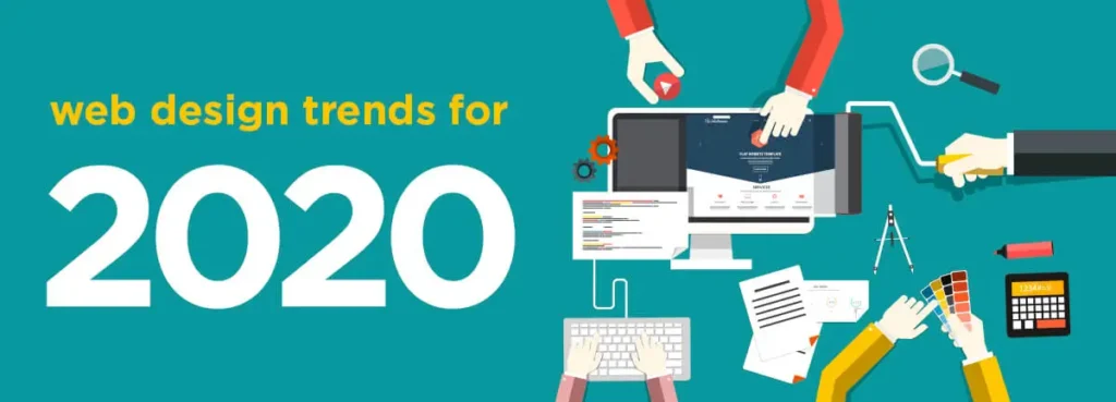
Here’s my take on the most exciting web design trends for 2020, and how you can make use of them in your own creations to ensure what you create is 100% en vogue.
Arty illustrations
They are trickier to pull off, and they need a little more thought than standard designs, but custom illustration styles certainly create more memorable brand graphics. As we move into 2020, abstract illustrations are proving to be particularly popular – especially those that combine photos with digitally drawn artwork.
The key is to come up with an illustration that’s quirky but still relevant and easy to understand. The last thing you want to do is confuse your audience with graphics that don’t support your brand message.
Another reason to invest in custom illustrations is this: they are difficult to rip off! Your competitors can’t copy and paste your designs, because they’re totally bespoke to your business and designed to emulate your brand identity.
Gradients instead of flat colours
Flat is out; depth is back. Gradients make any page more visually appealing, and they look great on both desktop and mobile. They can be used to draw the eye to an important part of the page, too, such as a hero message, call to action or contact form.
Don’t go over the top, though. Experiment with graded colour but stick to just two or three shades to avoid overcomplicating the design.
Black and white minimalism
Not a fan of busy, colour-laden templates? No problem. Black and white web designs are here to stay, and, when done right, they’re just as classy and elegant as they’ve ever been.
Retro styles
Many of this year’s hottest website designs are set to hark back to the 50s and 60s. Designers are consistently choosing to combine muted colours, scratchier images and clear, striking black and white accents to develop themes with a truly retro feel.
In-your-face hero messages
Hero messages have been dominating our designs for a few years now – but the typography being used is getting bigger, bolder and almost impossible to ignore.
This design tactic ensures your words dominate the page. Bolding out your hero messages will certainly add weight to what you’re trying to say, and it will also create a clear contrast on the page, which in turn improves the readability of the text. Just make sure you only highlight a phrase or sentence as opposed to a whole chunk of text, otherwise the content will be overwhelming (and probably unreadable).
Geometric shapes as dividers
Soft or hard-lined, colourful or more subdued, geometric shapes provide graphic designers like me with a more interesting way to separate content into sections on a webpage. Combine with gradients and bold fonts for a truly 2020 look.
Video headers
The industry has a love/hate relationship with video banners. Some designers love them because they’re eye-catching, they add movement to the template, and they can convey a richer message in a relatively short space of time. Others are not their biggest fan because they believe they are distracting the reader from the messaging on the page. They can also lead to slower loading times, which can impact the site’s usability and SEO.
Whatever your opinion, one thing’s for sure – video headers aren’t going anywhere anytime soon!
Dark modes
Users are increasingly favouring a shadier interface on desktop and mobile – so designers are increasingly enabling them to view their work in either light or dark mode. Apple started championing this trend by allowing users to switch between skins on iOS13.
It’s often a matter of personal taste. Darker UIs might be a bit heavy on the eye for some, but others find dimmer screens easier to read. Giving readers two design options instead of one is a sure-fire way to improve their experience of your brand.
A more systematic approach
Every website is unique, to a degree. It needs to be developed with the business’ needs in mind if it’s going to help them achieve their goals.
But though the site’s illustrations, typography and layout can be completely customised, the process that’s used to reach the end result needs to be watertight to ensure no stone is left unturned. From mobile responsiveness to SEO, there are so many things designers need to consider now when designing and building a website, so it makes sense that professional designers are increasingly wanting to establish a clear, comprehensive system for their work. If they haven’t done so already, 2020 will be the year that designers fine-tune their fact-finding, streamline their design process and iron out their testing methods to ensure their clients are getting maximum value from their investment.