A professionally designed logo can make a real difference to how a business is perceived. But sometimes, it’s easier to understand the value of good design when you can see the results for yourself.
Over the years, I’ve worked with businesses across all sorts of industries, helping them create new logos, refresh existing designs and develop branding that better reflects what they do.
Here are three client logo design projects that show how different the requirements can be, and how relatively small design changes can sometimes make a big impact.
Octopus Cabling
Octopus Cabling is a long-standing client of mine.
For many years, the firm specialised solely in designing and installing cable networks for businesses, industrial sites, and publicly funded organisations.
While this work still forms a large part of their operations, the company’s owner, Jonathan, wanted to add a new service to his arsenal back in mid-2021: fire stopping solutions.
I remember when Jonathan and his team first approached me to spruce up their logo.

Their first iteration from 2002 wasn’t so bad at first glance, you’d think – until you realise the octopus only has seven legs! This was a standing joke for years… in fact, we still laugh about it today!

By the time I took over their branding in 2004, their moniker had evolved, but the poor guy was still missing a limb.

Fast forward to 2015, and I had produced something much cleaner and more contemporary, with all eight legs intact.

When the company expanded into fire stopping services, I developed a coordinated logo for Octopus Firestop, retaining the established Octopus identity while introducing a distinctive colour palette.

As the business continued to grow, it became clear the client needed a logo for the overarching Octopus brand too. The greyscale version shown here is particularly versatile, as it can be used alongside the different colour palettes developed for each division.
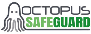
The Octopus brand has continued to evolve, and in 2025 the company introduced another division, Octopus Safeguard, specialising in commercial security solutions, including CCTV, access control and disabled refuge systems.
For the new division, I designed a logo that follows the established Octopus identity while giving Safeguard its own distinctive appearance.
It’s a great example of how a flexible brand identity can grow alongside a business, allowing new services and divisions to be introduced without losing that all-important consistency.
Indy Consultancy
I’ve been working with Danielle, the director and lead copywriter at Indy, for a very long time. I’ve seen first-hand just how much her business has evolved over the years, so I was delighted when she asked me to take a look at her existing logo.
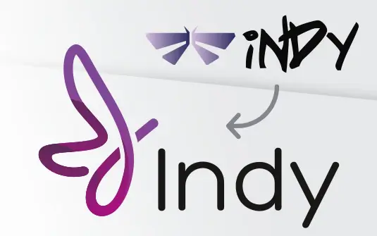
 There was nothing wrong with the design, per se. The scrawling typeface had been chosen on purpose to reflect the writing aspect of Danielle’s work, and the dragonfly had been added to represent the change and transformation that had inspired her to set up her own venture back in 2017.
Danielle felt it was time to explore a slightly different look, so I set about creating some new design concepts.

I worked with the original ideas and most of the brand colour palette but modernised the font and produced a softer-shaped illustration that gives the logo a much more fluid feel.
I’ve since updated Danielle’s website and business cards with the new design, and she tells me she’s received tonnes of compliments from clients and networking colleagues, which is always lovely to hear.
Process to Excellence
This was an interesting project, and one that I think definitely highlights the benefits of investing in professional help!
The client approached me having drawn up a basic logo in the popular app Canva.
Now, I’m not against working with tools like these if you need to create assets and documents quickly. I know plenty of my clients have used (and continue to use) Canva to produce things like flyer designs and social media banners.
But your logo is such an integral part of your brand.
If you’re creating a logo that will represent your business for years to come, investing in professional design can help ensure the finished artwork is distinctive, versatile and suitable for both print and digital use.

The client wanted me to tidy up the font and take inspiration from the brush-style design you see here, plus incorporate more of a gold outline to give the logo a classier finish, as he’d done in the mock-ups below.
Here’s the end result:

This is what the client had to say about his brand refresh:
“I was overly impressed with the service received from this designer. Not only did I get an incredibly quick turnaround, but she was very understanding of my needs from the get-go, knew exactly what I wanted and she came up with some amazing concepts before finalising the final assets. I would highly recommend and if ever needed I will be coming back to Design FX Studio.”
Looking for help with your business logo?
As these three projects show, every business has different requirements when it comes to logo design. Sometimes it’s about developing something completely new, while other times a thoughtful refresh can give an existing identity a new lease of life.
I’ve been designing logos and brand identities since 1993, helping businesses in Essex and across the UK create professional designs that work across their marketing materials.
If you’re thinking about a new logo or refreshing an existing one, take a look at my logo design packages or browse more of my logo design examples.