Contents:
- Can your business afford to cut corners?
- Distinctively British designs
- Logo design styles
- Why most logo designs should be simple
- Colour and shape: it’s the little things that matter
- A creative blend of familiarity and differentiation
- Recent design trends
Commercial logo design has a rich history. Since 1875, logos have served to represent our businesses and have played a huge part in how we perceive them. The power of the logo certainly shouldn’t be underestimated – logos have been shaped by, and continue to influence, our culture.
Experienced business owners understand the importance of logo design and how it can affect both brand positioning, brand loyalty and sales. As logo design is arguably one of the most important considerations when starting a business, it is essential to understand and consider each ingredient that makes up a great logo.
In this guide to logo design, I’ve gone into more detail about the process that needs to be followed to develop the perfect emblem for your company, regardless of the kind of audience you wish to attract.
1. Can your business afford to cut corners?
Creating the right logo is often more important for SMEs than multinational corporations. At a purely financial level, bigger businesses have the luxury of sizeable budgets to ensure that even a weaker, less appealing logo can be hammered into the public consciousness through repeated campaigns.
In contrast, an SME often has one brief opportunity to make an impression – which means that their logo has much more work to do when it comes to establishing a strong connection.
As you might expect, bargain basement logo design comes with risks. Design competitions and off-the-shelf options are a dangerous path to tread if you want to develop something that’s going to go the distance. Without the knowledge of an experienced designer, can a company be sure that their shiny new logo doesn’t end up using a design or colour scheme that really doesn’t suit their product or values?

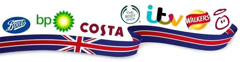
2. Distinctively British designs
The internet is rich with inspiration for logo design, but not all cultures respond well to the same imagery and branding. In general, British branding is more subtle than that which is seen in the USA.
Much of America’s branding and advertising campaigns often appearing garish and exaggerated to the British market – but it’s all about what works.
3. Logo design styles
The question is, which logo design style is best suited to your business?
Logo Style 1 — The Lettermark
Lettermarks are typically stylised initials and acronyms, often used by industry heavyweights whose marketing team who know that the public are already aware of their brand. Organisations such as the BBC, Marks & Spencer and ITV are all so widely-recognised that they don’t need much more than their mere initials in their moniker!
The minimalism of a monogram can make a logo very flexible and can ensure that it can easily be used across a wide range of media, but it relies on that brand already being well-known. For less established businesses, lettermarks can be a gamble, as it can be tough to achieve adequate brand recognition with them. An SME that chooses a lettermark should seek out the skills of a good designer to ensure that it creates the right impact.
Logo Style 2 — The Iconic Mark
The lack of text in this type of logo means that iconic marks rely heavily on a brand having already established a major presence. Nike is now little more than a swoosh and, as Naomi Klein would point out, their brand is far more valuable than their products. Such symbols are now part of mainstream consciousness thanks to years of advertising, leaving any text unnecessary and just a distraction.
Whether abstract (Pepsi) or pictorial (Apple), this level of vagueness is best left to multinationals with vast marketing departments that can build emotions and stories around a logo design that is incredibly minimal. As well as a physical versatility (they scale up and down very easily), these symbolic marks have a built-in flexibility of meaning – something that gives massive corporations the potential to create a wide range of connections, however they decide to evolve.
Logo Style 3 — The Wordmark
At the other end of the visual scale is the wordmark, which is also referred to as a logotype. It is equally simple but uses just the brand’s name rather than an image. If the company name is generic, even the most well designed wordmark might not be able to do enough to convey a brand’s message. However, if a name is distinctive and unique, a wordmark might be all that’s required for a successful logo.
Memorability is no longer an issue here, but brands employing wordmarks might find that scale can be a problem, especially when it comes to business cards. Shrinking text quickly makes it unreadable, but the implications can be a bit more subtle; very often, different typefaces lend themselves to different sizes and formats.
As well as the practical aspects of wordmarks, the psychology of a typeface should be given plenty of thought. As there are no supporting graphics that would allow consumers to understand the mood or tone of a brand, the typeface used within the design is vital to its success.
Logo Style 4 — The Combination Mark
Blending the principals of the icon and the wordmark, the combination mark is the most common type of logo. Combination marks give designers the flexibility to combine playful, intelligent typographical flair with sophisticated yet minimal graphics, often to the point where the division between the text and the image is no longer obvious.
Simplicity is fundamental to good logo design, allowing for greater clarity and memorability. Because it incorporates two different elements, it is perhaps even more important that a combination mark is kept simple. Most large companies avoid gradients, and the vast majority — 95% of the world’s top 100 brands — use only one or two colours within their designs.
Logo Style 5 — The Emblem
Emblems, where text is contained within a graphical element — such as a badge or circle — are most frequently used by car manufacturers, government institutions and sports teams. However, but with the explosion of hipster culture comes a love of all things vintage and a sense of hand-crafted authenticity, which is why emblems are enjoying a bit of a renaissance right now.
The emblem is the go-to choice for many companies, young and old, that want to draw on a sense of nostalgia.
But using emblems can create constraints. Scale can be an issue, as can the fact that the emblem is self-contained.
Whilst a combination mark can be easily reshuffled to suit different purposes, it is much harder to isolate elements of an emblem and still keep a sense of consistency across the brand.
When they’re done well, however, emblems can be very distinctive, especially for companies who want to stand out from their competitors.
4. Why most logo designs should be simple
During the design concept phase, it is important to consider how the logo will be used, as it may be implemented across a variety of media and may have to exist in a multitude of digital and printed formats such as websites, television ads, business cards and clothing.
Ask yourself: are crucial details clear when the size is reduced? And how will its colours and form interact with its surroundings? The clarity and impact of a logo shouldn’t change even when it’s used in different formats.
A designer should present their client with more than just a standalone design. In fact, the logo should be part of a completebranding identity. A single, striking idea can be expanded to build creative design variations, such as colour palettes used for specific marketing campaigns, or monograms that can be embroidered on baseball caps, printed on fleet cars or used as a watermark.
5. Colour and shape: it’s the little things that matter
When it comes to logos, you would be forgiven for thinking that the shapes and colours used in the design are just down to personal preference. Everyone has a favourite colour, right?
Actually, people often perceive colours and shapes predictably – and these factors can deliver a multitude of emotions.
For example, red is often perceived as a physical colour and can represent anger, fear, love or excitement. Green, on the other hand, represents balance, wealth, nature and health.
Shapes with sharp corners and straight edges represent professionalism, efficiency and stability, while circles depict community, love and loyalty.
You can’t be everything to everyone and, if you try to please all kinds of audiences, you may miss the mark completely. It is important to consider what the business represents and how you want it to be perceived.
6. A creative blend of familiarity and differentiation

A logo is a graphic representation of a business and its values. While it can set you apart from your competitors, it can also demonstrate which businesses you are most similar to and what the company stands for.
But branding doesn’t – and shouldn’t – stop there. For example, if the logo stands for customer satisfaction, the company should innovate in this area to develop strong customer relationships, user-friendly systems and unmatched customer service. Over time, the business will likely yield a passionately loyal customer base which will reflect the company’s values. This will inevitably affect how the logo and branding are perceived in the future.
6. Recent design trends
This article wouldn’t be complete without discussing the UK’s most recent logo design trends! Designs seen over the last few years typically make use of the following:
- Flat, simple shapes
- Single/two colour designs
- Geometric elements and forms
- Simplified line drawings/monolines
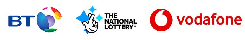
- Creative use of white space (see Vodafone)
- Subtle stripes, zig-zags, and waves used to depict movement
Of course, the fashion might change. But what’s interesting is that these designs are synonymous with low print costs and effortless mental recall – so it could be tricky to find a better combination of key elements for business logos.